Bulletproof Brand Refresh 2020
Bulletproof is functional nutrition, here to prove that better is closer than you think. We re-imagine nutrition with science-backed and thoughtfully sourced ingredients to create quality additions to your daily wellness routine. Whether you’re supplementing your vitamin intake or fueling your workout, Bulletproof can help you discover what better feels like.
Service
Branding
Package Design
Art Direction
Agency
Hatch
Year
2020


The Problem
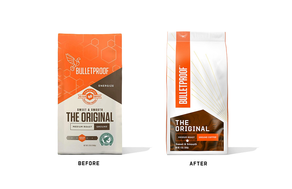
Bulletproof was a brand that had a cult following in the early days of the Keto diet craze. In the wake of that moment, the brand had significant brand awareness, but was also viewed as just a "biohacking" brand, and not an everyday wellness brand. There was a clear need for a more approachable brand identity in order to gain consumers that were aware of the brand, but hesitant to try.


The Opportunity
Through strategic insights we were able to identify key equities to lean into, and certain equities we could stand to lose. We determined that our logo was strong, but needed to come up in scale and slightly modernize, We decided to ditch the cream and go for a more stark white that feels more modern and speaks to our clean ingredient story. We also decided to maintain the angular design language that speaks to mental performance, but added an energetic flavor forward pattern and a burst of gold rays, which speaks to our brand promise of "unleashing your limitless potential" and adds a level of activation and elevation on pack.


The Results
The 2020 rebrand, supported by increased marketing, was successful in repositioning the company for a wider market and allowed for substantial retail expansion. The rebrand aldo helped facilitate an expansion into major mainstream retailers, including Kroger, Target, Walmart, Publix, and CVS, in addition to existing presence in stores like Whole Foods and Sprouts.


